I had the privilege to design the brand identity for a catering company called The Guilty Pig and located in South Arkansas. And while my favorite wasn’t selected, I’m still proud of the work that resulted in the final design. Because I loved some of my iterations so much I wanted to share them all here.
Of course in the midst of the design process, as I bounce ideas off of designers and others, I find that everyone has a favorite and it’s not always the same one. But one of a designer’s tasks is to synthesize that feedback to improve upon the concept, and that is what you will see here. Even though I feel the final product is a bit homogenized, it still stands strong when compared to other pig logos for catering companies and food trucks discovered while researching for the project.
What’s the pig idea?
As I began to ideate on this project I had to wrestle with the thought of how do you make a pig look guilty. Various facial expressions that I toyed with in sketches came off as smug, or sly, or maybe sleepy. So I had to rethink the perspective of where the guilt is coming from. My initial idea that the pig actually felt any guilt on his own, and thus making the corresponding facial expression, was completely the wrong direction.
It came to me one day while I was thinking about my dog. She might walk in all smiles and wags, like nothing is wrong, but have some food from the trash on top of her head. She’s guilty. The evidence is all there. It’s obvious what crime has been committed and who the perpetrator is.
So I took this approach with the mark for the pig. His guilt is smeared all over his mouth and everyone knows it but him! And then as I felt I had a strong concept I made a few variations.
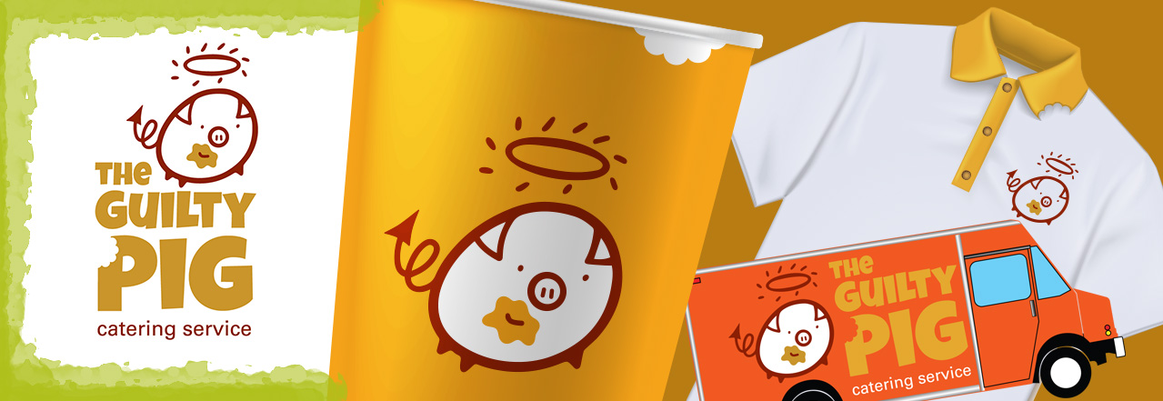
Brand Identity Iterations. We see what you did there.


I absolutely loved the idea of creating all of these little die-cut bites being taken out of everything. Especially the collar of the shirt. I like the double whammy of having the pig kind of fronting the halo, but flipping a devil’s tail behind. The bite taken out of the P and the color of the type smeared on his little face. It makes me happy to look at it. The lil’ piggy is just so simple and fun. Alas, he was too simple for the client’s taste, who opted for a more pig-like piggy face. (By the end of this article, pig isn’t even going to sound like a word any more.)
Happy little circles


This logo takes the halo and pointy tail only to show innocence with a little guilt. Sometimes for logo marks I will try a version reduced to its simplest shape and contain necessary elements as much as possible. A circle just felt right for the pudgy little pig. I really like the snout to smile area on this one. It kind of takes care of two features with one line. Simple. As it should be.
Typographic brand identity solutions


This solution played on using the lowercase g as a logotype. I abandoned the halo in this version altogether in lieu of the pointy devils tail forming the loop of the g. I kind of liked this one but had a suspicion it would be a little “out there” for the client. But hey, nothing ventured nothing approved.
Breaking through the glass, squealing.
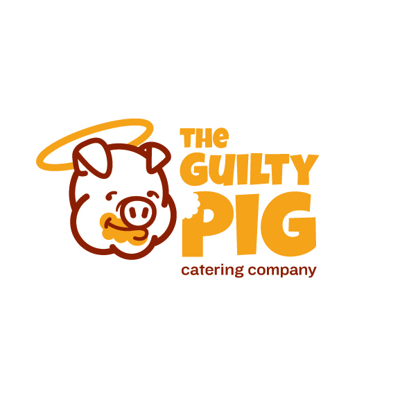

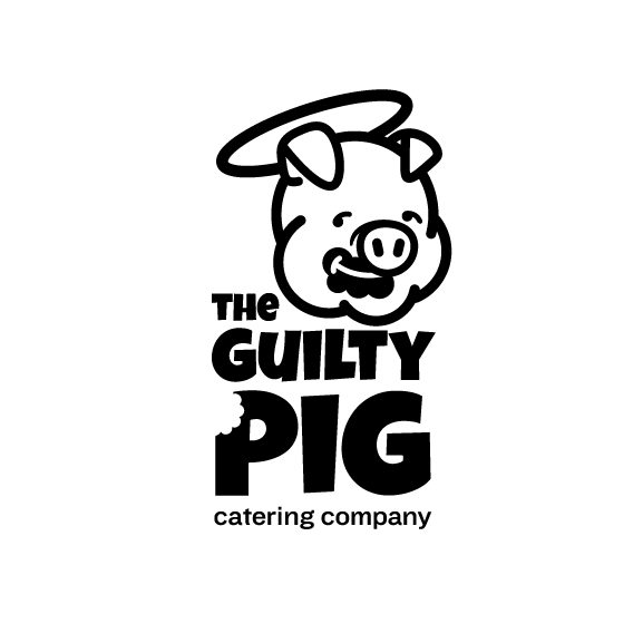
There it is. The final brand identity in all of its glory. Still grinning, haloed, messy mouthed, with a bite out of the type. As I said earlier, the client wanted the pig with extra pig on top. Overall fun project. If you need some branding or identity for your project let me know!